Years ago, Congress commissioned a government agency to “develop an energy display system which, in less than an hour, could give an extremely busy person an understanding of the size and the complexity of our national energy dilemma.” Just what we need today!
Fortunately, our colleague Saul Griffth, prepared a recent update. An image of this map does not do it justice, use the interactive version at: http://energyliteracy.com. The project was funded by DOE, under contract DE-AR0000853.
A Map of Opportunities in the Energy Transition

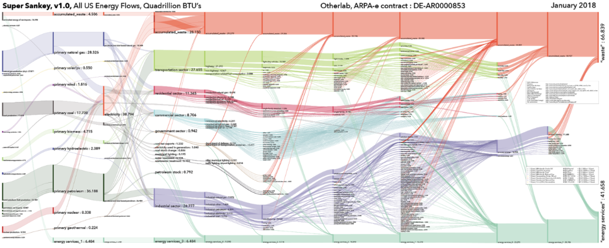
2018 “Super Sankey.” The interactive online version at http://energyliteracy.com allows the viewer to drill down into any particular industry sector and understand the energy that it produces or consumes.
Start at the left, these are the sources of energy use. The far right are the uses of energy, such as in our homes, our industrial machinery and so on. What is compelling about the work of Saul and the Otherlab team is the micro-detail of every path between source and use.
Consider coal, for example. The black clumps of coal is the raw energy material, and it is delivered to a coal-fired plant and turned into electricity. Already there are two events in the, the delivery of coal and burning of coal. In the map this would be shown as a fat line getting two steps thinner as each event required energy. But to keep inputs of energy equal to outputs of energy the map goes one step further.
I encourage you to take your finger and follow the lines from source to use. You’ll see part of the line flowing forward, and part of the line floating up to the red fat line at the top. The energy flowing forward seems to disappear. This is due to the nature of fossil fuels. If a 100 BTUs enter a coal plant or a petroleum refinery, in the map a 100 BTUs leaves. But in two forms: Useful Energy and Waste. At each event a red line floats up to the top to a big fat red line. That’s the accounting for waste.
For coal Useful Energy is about 60% of the output. Over the years, we’ve been inventing more efficient coal plants, but intrinsically there are laws of physics that limit the size of further improvements. This same set of physical limitations is part of the map at many, many steps. From big industrial plants, to cars and trucks, to our homes.
For consumers, two big areas of energy waste are cars and home heating. Cars produce about 50% waste, in that the car engine transforms gasoline into forward motion, but needs a lot of energy to do so. Home heating with natural gas produces about 30% waste. The beautiful set of data in this map pinpoints these moments of transformation, wherever they occur.
In aggregate, US energy use produces about 50% Useful Energy and 50% Waste. For this example: If we used 100% solar energy as our source, there would be very little waste within each flow, 2 – 3%. Some flows can’t use solar energy as a source, so overall we might be down to 15% Waste.
For climate solution entrepreneurs and investors, this map is gold. It identifies opportunities with great detail. Now identify the buyer at each, figure out the technology that the buyer can authorize that produces the same effect or service — such as producing hot air. Make sure the technology delivers compelling savings. Voila!
The buyer analysis is key. We not only have 1000s of business opportunities but also 1000s of buyers. Each buyer type will have a set of needs and constraints. Great entrepreneurs will figure out the right product at the right price for the buyer type.
And finally, test this map against the legislation working their way through Congress. Do they change how energy is used? For which groups? How does it add up? This “energy map for busy people” is the right place to start.
https://www.saulgriffith.com/blog/gnd-shooting-for-the-moon
https://saulgriffith.medium.com/one-billion-machines-48a7c3cf0694


