July was the hottest month in the planet’s history. How much of this heat was “normal” and how much was due to climate change? A new data service starts to provide the answers.
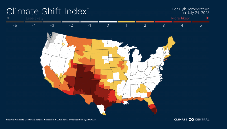
Meet the Climate Shift Index. This color coded guide is the output of work by Climate Central using science, big data, and technology to categorize daily temperatures into expected components and human-caused climate change components.
Weather – the daily ups and downs of temperatures, winds, snow and rain – is always shifting. So the impact of long-term climate change is on probabilities. With climate change in place, the daily temperature is more likely to be extreme.
The scientists at Climate Central built a mathematical model by locale showing when climate change increases the chance of extreme weather. Their color scale ranges from white (no change) to dark red (high temperatures 5X more likely).
The map below shows the index for the temperatures across the U.S. on July 24, 2023. Texas, Colorado and New Mexico were blanketed by a heat dome that is largely attributed to climate change.
As July came to a close, the first headlines have been “hottest month on record”. But the next wave of headlines is more profound, “economic cost of persistent heat”. Yes, GDP is affected. So now we have a direct link from daily weather fluctuations to climate change to the economic impact of climate change.
The Climate Shift Index and other similar tools will change the business conversation, as they help to quantify the economic risk at hand from long-term climate change. As we move from concern to math models to emission reduction plans, accurate and abundant data is key. GLYNT is proud to be part of the solution.
Sources:
“With Record Heat Expected, These 5 Maps Show What’s to Come across the U.S.” The Washington Post, July 20, 2023
“U.S. Climate Shift Index TM Map” Climate Central, 2023


