The results were “sobering,” say the authors, as the extent of the data gaps was larger than expected and the accuracy of estimation methods was terrible.
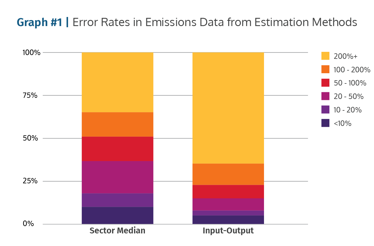
To understand the issue, look at Graph #1, which shows two estimation methods and their error rates when compared to actual Scope 1 and 2 emissions disclosures.
If the Sector Median method is used to estimate emissions, more than 30% of the estimated data is off by 200%+, as seen by the light blue area at the top of the first column. Overall 50% of the data has an error rate larger than 50%.
The situation is worse for the widely used Input-Output estimation method. In this case more than 70% of the estimates were off by 200%, and 65% of all estimated data has an error that is 50% off or larger.
Clearly current estimation methods don’t work.

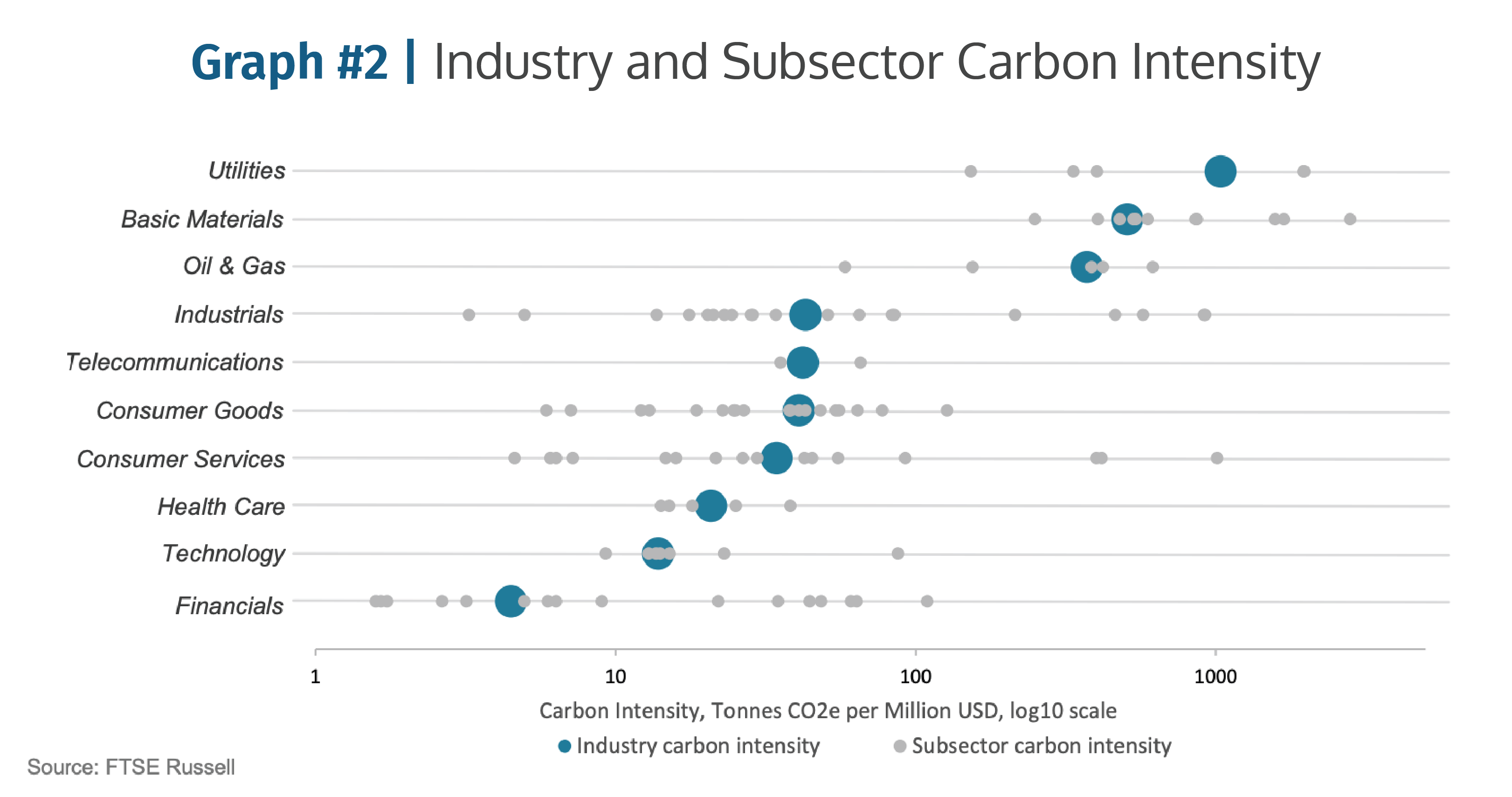
Graph #2 shows where analysts want to go with emissions data, to within-sector comparisons that make sense.
But when FTSE Russell plotted the current disclosed data into 10 industries and 173 different subsectors, the results show the intrinsic problem: too much data dispersion to draw clear conclusions.
How much of this dispersion is from data estimation errors and how much is real? Analysts can’t tell. So within subsector comparisons become meaningless.

Are you using manual data entry, spreadsheets and back-of-the-envelope estimates? Are using industry-averages? Get an instant data upgrade with GLYNT. Investor-grade data from the start.
Get Started with GLYNT


